This is the first in a series of blog posts written during my time at Flatiron school. More posts will be added as time goes on!
A little bit about me and why I love design
Prior to joining the Flatiron school to be a software developer, I had some experience in the game industry primarily as a 3D artist. Creating art assets and thinking about the player experience was a big part of my job, so the appreciation for great visuals, how they’re made, and why never really left after my exit.

My instruction at Flatiron school is helping me translate those skills quite nicely into software development and it’s giving me a greater understanding of what’s going on under the hood with the applications we use.
So what’s all this about C.R.A.P?
I guess those that work closely with software have a knack for creating acronyms. C.R.U.D. D.R.Y. Some sound nifty, but others, I’m not so sure. It does get the message across! C.R.A.P is a design principle that stands for the following:
- Contrast
- Repetition
- Alignment
- Proximity
Usage of all four leads to visually appealing sites and applications. Gone are the days of the ’90s where we had pixelated gifs and iFrames.
Things have spruced up a bit.

We’ve come a long way, so much that companies are developing their own design systems to ” [build] better and faster; better because a cohesive experience is more easily understood by our users, and faster because it gives us a common language to work with.”[1].
While developers may not touch a lot of things in the design process, it’s helpful to know the language of designers to understand where they’re coming from and the choices that they make, possibly helping you build out their designs when it’s time to implement them.

Let’s go over some examples of each of the four principles.
Contrast
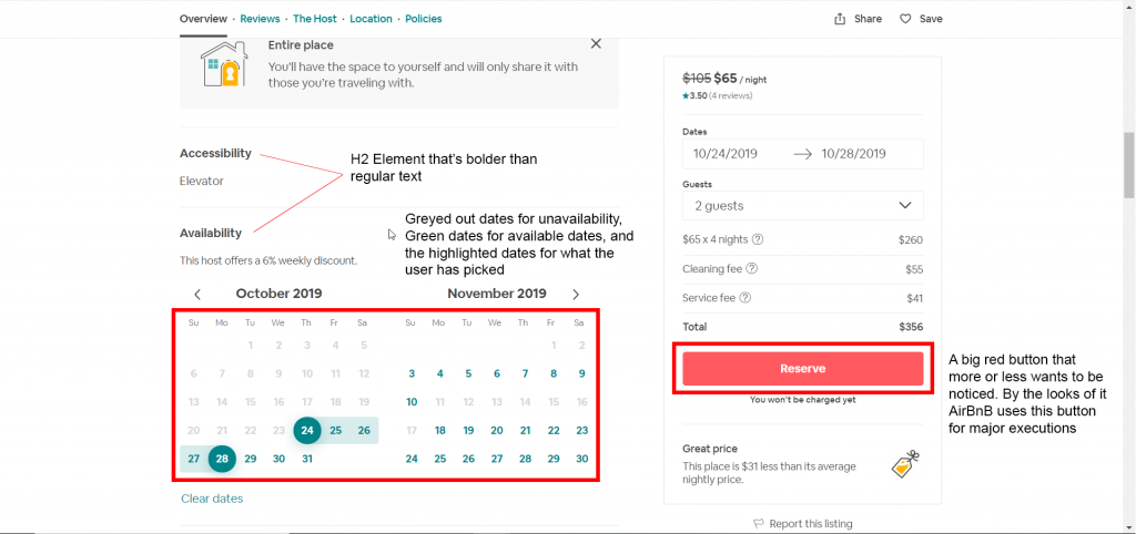
A definition provided by Google is “the state of being strikingly different from something else in juxtaposition or close association.” Another way to put it is to make something stand out from everything else. Sometimes, we want to draw attention to certain elements in our applications and you can do that by utilizing contrast.

Contrast can be established through color, size, font usage, spacing from elements (more on that later). Take a look at a portion of a listing from Airbnb below.
Repetition
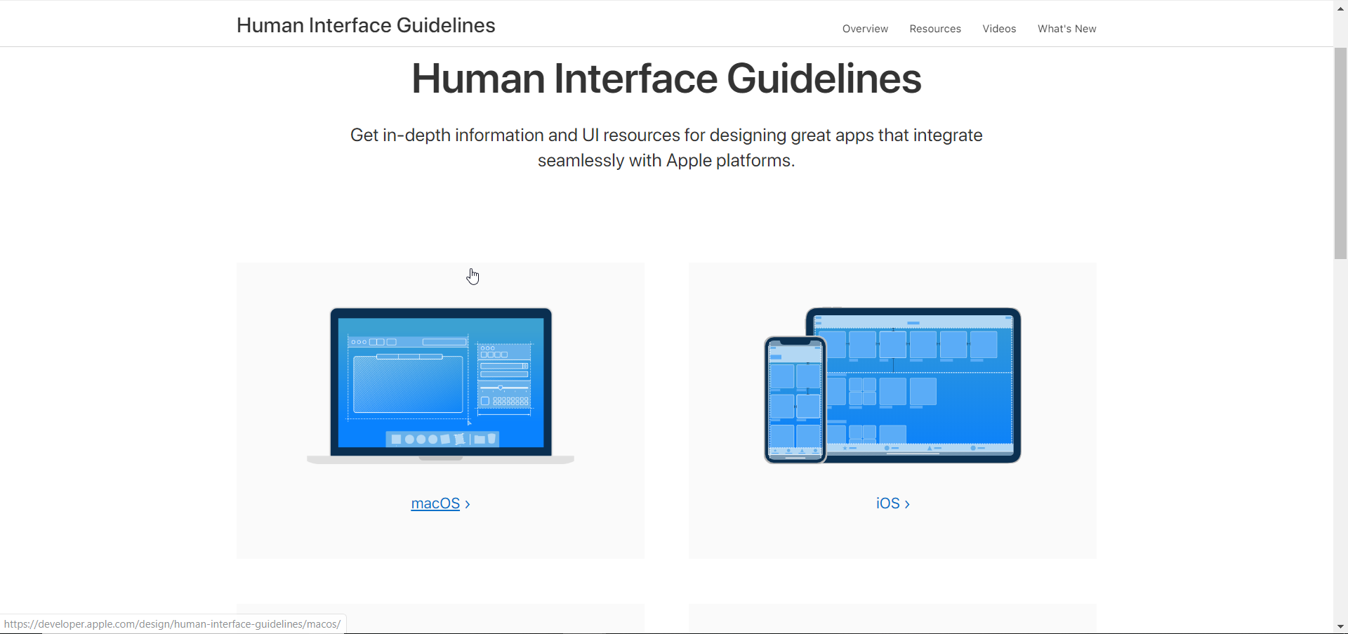
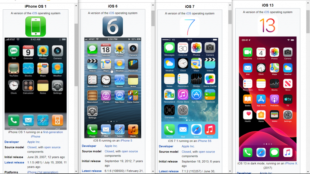
Repetition is a means of establishing consistency and train users to expect certain outcomes as they interact with an application or website. Think about Apple products and their user interfaces for a moment. Even though iOS has gone through incremental changes since its start in 2007, we more or less know how an Apple product behaves and expect it to look and feel a certain way. That, in part, is a conscious choice of being repetitive in their designs for all these years. By using repetition, Apple maintains brand identity, trust and familiarity. Users pretty much know what to expect when getting an iOS product.
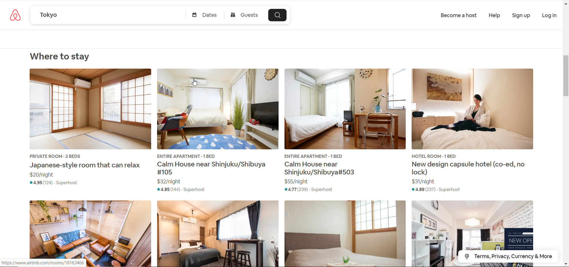
Looking at Airbnb again, we look at the “cards” below that have more or less the same style, and so users can choose what they want based on content more so than contrasting design styles.
Alignment
Alignment gives a sense of order to a design so that information is readable and coherent.
Side note: I really like DotA 2. Like, really, really, like DotA 2. Patch 7.00 introduced a redesign to the UI which I think serves as a good example of alignment. Below is from Patch 7.22h.
The hero portraits are on a neat grid system, with a selected hero and their attributes displayed neatly on the right.
Proximity
The principle of proximity deals with grouping similar objects together and separating those that are different. When one visual element is grouped with a bunch of others, it gives a clue that they’re somehow related. This principle puts an emphasis on organizing data into chunks that are digestible. Let’s look at the DotA UI again.
One of DotA 2’s big UI challenges is trying to organize so much character information on one screen while trying not to make it too cluttered. There are currently 100+ heroes available, each with their own unique attributes and abilities.
Valve made the choice of grouping heroes by their main attribute: strength, agility or intelligence. The headers above each grouping kind of gives a clue that the heroes under the header are that type. For a newbie, unfortunately, that doesn’t mean much, but for those acquainted with the game, it gives an idea of what hero you may want to pick.
For the character card on the right, it’s size and separation from the portraits gives a clue that it serves a different purpose, in this case, character information.
Wrapping Up
This is just a small exploration of the four principles that govern a lot of websites and applications that we interact with on a daily basis. In the context of us as software developers, some questions that we may want to think about could be, “Well, if this is a repeatable element, what combination of methods should I use to not repeat myself in my code?”
In a future post, I’ll explore some tools that could help us implement CRAP efficiently. Also, check out some of the links below for some extra reading materials
Footnotes and Extra Reading
[1]. Saarinen, K. (n.d.). Building a Visual Language. Retrieved from https://airbnb.design/building-a-visual-language/.
Introduction to DotA 2 UI update in Patch 7.00
Apple Human Interface Guidelines

