Time:
January 2018 – March 2018
Roles:
User Research, User Interviews, Journey Mapping, Sketching, Wireframing, Screen Flows, Visual Design
Overview
This project was the main focus of the UX/UI Mobile Design Certificate Program at Pratt Institute in New York City. The project challenged designers to answer the following question: How may we improve the way that people travel? The project took us through the entire design process of a mobile application, from the initial research phase to visual artifact creation, to finally, prototype development.
Challenges and Constraints
Each designer was tasked to focus on one segment of traveling and develop a feature that can anchor the journey. We had to choose an age demographic from the following list:
- Adventurers
- Families
- Empty Nesters
- Business people
These were the segments of travel we could choose from:
- Arranging travel
- Creating itinerary
- Transit and documents
- Connecting and communicating
- Documentation and sharing
Ultimately, the demographic/segment pair I chose was the Adventurers/Creating itinerary pair since I was in the middle of planning a solo trip to Japan at the time. I took the opportunity to put myself in the shoes of the people I was designing my feature for and figure out what’s a new way to help adventurers plan their itineraries.
How do people plan their trips to begin with?
Based on the assignment, the Adventurer demographic included people that were single or newly married with no children. They had limited disposable income, typically traveled for more than a week, and may occasionally travel in groups.
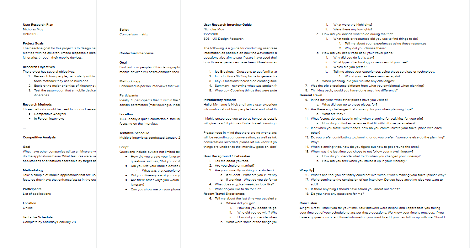
My gut reaction was that these people were essentially millennials and it influenced how I conducted my initial phases of research, particularly with in-person interviews and market research. However, when I was discussing the project with a friend of mine on a typical Sunday, she noted that I should consider expanding who I interviewed since the assignment never limited the age brackets of the adventurers. Fair point! Below are samples of the research plan and interview guide that kept me focused when conducting research.
Research Data Synthesis
Based on the data from in-person interviews and market research, I organized my observations by using an affinity map. I also used a customer journey map to help me envision the itinerary planning portion from start to finish and identify pain points.

Here’s what I found out.
Information Overload
It’s not a new topic of discussion, but with the internet at our fingertips and with so much access to information, we know a lot more, but the information can be hard to process. Travelers found themselves overwhelmed and weren’t sure where to start. There can never be too many tabs on a web browser open. However, one thing that grounded adventurers is what interested them. A common phrase that came up was, “Do whatever interests you”.
Do all the things!
Some have already made or expressed willingness to make a return trip to where they went before in order to have a sense of completion. Users saw things during their research or on their travels but couldn’t do it due to constraints, be it time, money, or because of traveling companions. However, they made a note of it for the future.
Can I trust what these people are saying?
Some have felt at times that blogs or user comments were unreliable. Were they paid blogs? How can these comments be vetted? At one point or another, travelers have consulted people that they trusted at one point or another.

Key Challenges
One of the big themes based on user researched revolved around content overload and choice. Like their namesake, adventurers wanted to go on adventures and find unique experiences, so why not peruse apps and the internet to see what the world has to offer? However, deciding what to do had an overwhelming effect. Therefore, based on findings, I set out to answer the following:
- How can we help people narrow down their choices knowing their interests and where they’re going?
- How might we assist people in keeping track things they wanted to do for future reference?
- How might we be able to assure users that the information that we are presenting is trustworthy and verifiable?
Designing solutions
Music applications were a big inspiration for the design choices that I had come up with. These days, music applications act as an assistant of sorts by helping us discover new music we’ll love based on the music we already listen to, but also occasionally push our boundaries, little by little. In a similar way to traveling, we have all this access to music that we’re not sure what to do with all of it. Music services help us navigate that space and create a sense of users being known by slowly establishing trust and suggest new music within the bounds of our tastes. I wanted to achieve that same feeling with my designs.
Content aware suggestions for Travelers
My application would take in whatever points of interest the user has saved and where they’ve gone in the past to give more robust travel suggestions as time goes on. I envisioned that in some instances, it would give something familiar, and in other times, it may slowly push our boundaries and encourage us to try something new. Suggestions would only be given a few at a time for easy consumption and would also give users the opportunity to save points of interest. Effective copywriting is crucial at these times of suggestion.


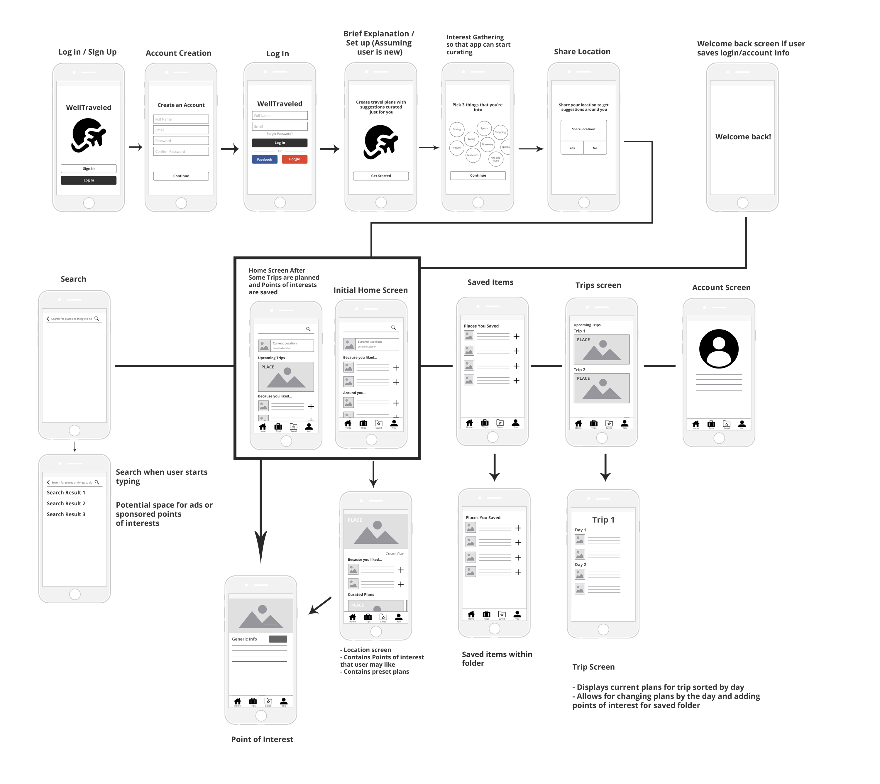
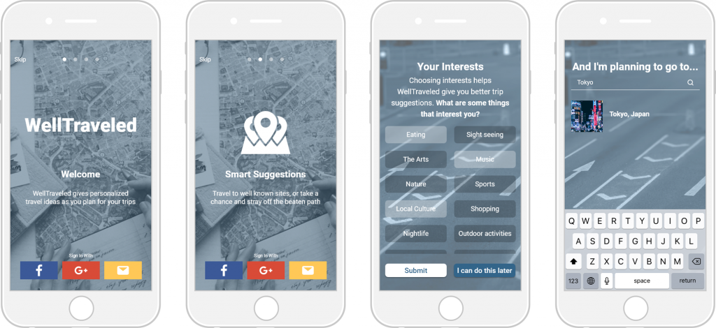
Onboarding
I designed the onboarding experience of my application, which I would eventually name “WellTraveled”, to let users know what the core features were and invite them to submit some interests and a place they were planning to go to in order to get things started quickly.
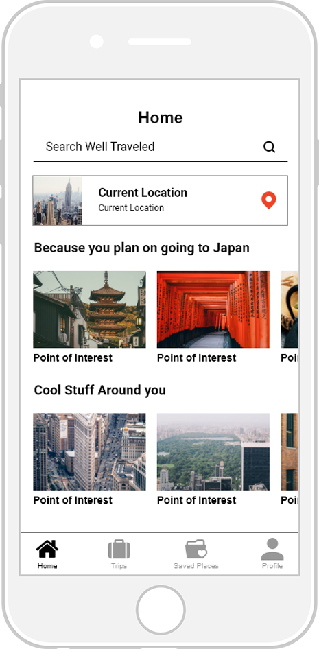
Personalization
After the initial onboarding process, the welcome screen will curtail its display based on what user inputted before. Users will return to this home screen when they intend to use the application at a later time.
Location Details
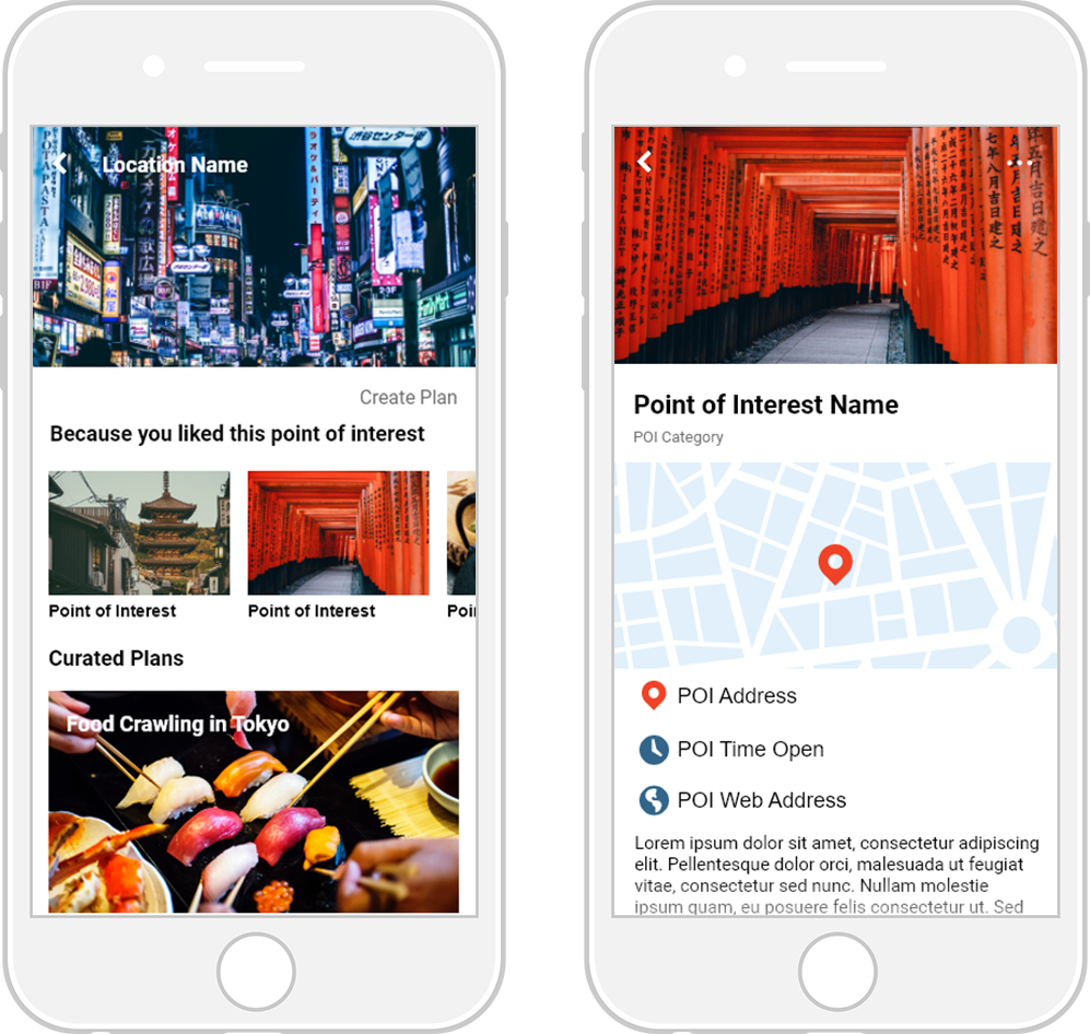
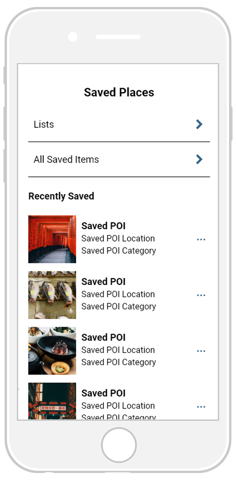
Saved Places